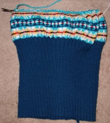
Although the knitting itself looks just fine, and the fair isle bit isn't nearly as hard as I thought it would be,
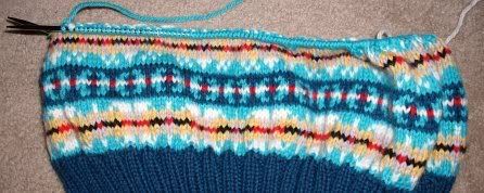
it's ugly as sin. This color scheme could not be uglier if a circus threw up on it.
It looked fine on the website. When I was ordering the yarn, the colors looked far more muted, like they'd blend into each other and create something close to what was in the original pattern, but in more of a fog-and-sky sort of theme.
As you can see, they're not muted. They're louder than a marauding air horn. I've been trying to tell myself for weeks that there's nothing really wrong with them, that it'll all work out because it's set against dark blue, but the plain, honest truth is that there is something wrong with them, and that something is that they are ugly, and there's nothing I can do about it.
Next time, I'm buying a color card first.
Mood: angry
Music: The Frames - Falling Slowly

